Majorsoft.Blazor.Components.Debounce
2.2.0
dotnet add package Majorsoft.Blazor.Components.Debounce --version 2.2.0
NuGet\Install-Package Majorsoft.Blazor.Components.Debounce -Version 2.2.0
<PackageReference Include="Majorsoft.Blazor.Components.Debounce" Version="2.2.0" />
<PackageVersion Include="Majorsoft.Blazor.Components.Debounce" Version="2.2.0" />
<PackageReference Include="Majorsoft.Blazor.Components.Debounce" />
paket add Majorsoft.Blazor.Components.Debounce --version 2.2.0
#r "nuget: Majorsoft.Blazor.Components.Debounce, 2.2.0"
#:package Majorsoft.Blazor.Components.Debounce@2.2.0
#addin nuget:?package=Majorsoft.Blazor.Components.Debounce&version=2.2.0
#tool nuget:?package=Majorsoft.Blazor.Components.Debounce&version=2.2.0
Blazor Components Debounce Input controls


About
Blazor components that are rendering HTML <input>, <textarea> elements also extending InputText and InputTextArea Blazor provided components with debounced (delay) event for onChange. All components work with WebAssembly and Server hosted models.
For code examples see usage.
You can try it out by using the demo app.
Components
DebounceInput: wraps and renders HTML<input>field with debounced (delay) event for onChange.DebounceInputText: extendsInputTextBlazor provided component (it supports form validation and@bind-Value=) and adds debounced value changed event notification.DebounceTextArea: wraps and renders HTML<textarea>field with debounced (delay) event for onChange.DebounceInputTextArea: extendsInputTextAreaBlazor provided component (it supports form validation and@bind-Value=) and adds debounced value changed event notification.
DebounceInput and DebounceTextArea components
Blazor components that are wrapping around standard HTML <input>, <textarea> elements and provide debounced (delay) notification functionality.
Can fit for any Blazor app e.g. when making async server calls on user input (search) but you don't want to waste resources by sending requests on each key pressed.
DebounceTextArea and DebounceInputTextArea components
Blazor components that are wrapping around standard exiting Blazor components. Rendered HTML result will be standard <input>, <textarea> as well.
Can fit for any Blazor app but use this only when you need Blazor provided FROM validation as well.
Properties
All components have exactly the same features only rendering different HTML elements, hence they have the same properties, events and functions as well.
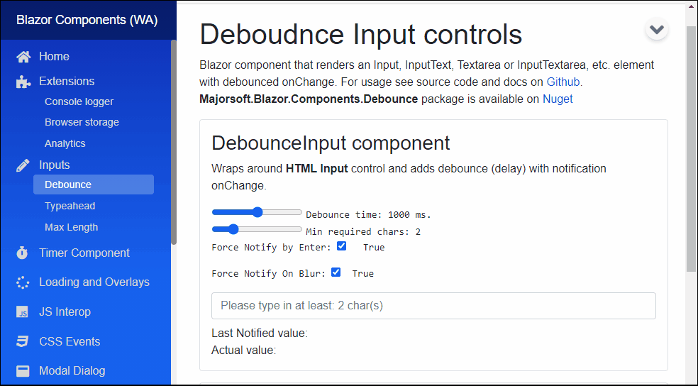
Value:string? { get; set; }<br /> Value of the rendered HTML element. Initial field value can be set to given string or omitted (leave empty). Also control actual value can be read out (useful when MinLenght not reached). <br />* Note: in case ofDebounceInputTextandDebounceInputTextAreathis property is inherited from Blazor component and requires slightly different code with@bind, see usage example differences.DebounceTime:int { get; set; }(default: 200) <br /> Notification debounce timeout in ms. If set to0notifications happens immediately.-1disables automatic notification completely. Notification will only happen by pressingEnterkey oronblur, if set.MinLength:int { get; set; }(default: 0) <br /> Minimal length of text to start notify, if value is shorter than MinLength, there will be notifications with empty value"".ForceNotifyByEnter:bool { get; set; }(default: true) <br /> Notification of current value will be sent immediately by hitting Enter key. Enabled by-default. Notification will obey MinLength rule, if length is less, then empty value "" will be sent back.ForceNotifyOnBlur:bool { get; set; }(default: true) <br /> Same asForceNotifyByEnterbut notification triggeredonblurevent, when focus leaves the input field.InnerElementReference:ElementReference { get; }<br /> Exposes a BlazorElementReferenceof the wrapped around HTML element. It can be used e.g. for JS interop, etc.
Arbitrary HTML attributes e.g.: id="input1" class="form-control w-25" will be passed to the corresponding rendered HTML element <input> or <textarea>.
<DebounceInput
	id="in1"
	class="form-control w-25"
	OnValueChanged="e => { DebounceInputValue = e; }"
	placeholder="@("Please type in at least: " + @MinCharsLength + " char(s)")"
	... />
Will be rendered to:
<input id="in1" class="form-control w-25" placeholder="Please type in at least: 2 char(s)" ... />
Events
OnValueChanged:EventCallback<string>delegate - Required <br /> Callback function called when value was changed (debounced) with field value passed into.
Configuration
Installation
Majorsoft.Blazor.Components.Debounce is available on NuGet.
dotnet add package Majorsoft.Blazor.Components.Debounce
Use the --version option to specify a preview version to install.
Usage
Add using statement to your Blazor <component/page>.razor file. Or globally reference it into _Imports.razor file.
@using Majorsoft.Blazor.Components.Debounce
Dependences
Majorsoft.Blazor.Components.Debounce package depends on other Majorsoft Nuget packages:
- Majorsoft.Blazor.Components.Timer which provides the debounce time feature.
DebounceInput and DebounceTextArea usage
Following code example shows how to use DebounceInput component in your Blazor App with model binding
on specific OnInput event. So it will enable two way binding between components. You can omit it and use Value directly for one way binding.
Note: using DebounceTextArea component basically the same but it will render HTML <textarea>.
<DebounceInput id="in1" class="form-control w-100" placeholder="@("Please type in at least: " + _minCharsLength + " char(s)")" autocomplete="off"
	@ref="input1"
	@bind-Value="@_debounceInputValue" @bind-Value:event="OnInput"
	DebounceTime="@_debounceMilisec"
	MinLength="@_minCharsLength"
	OnValueChanged="e => { _notifiedInputValue = e; }"
	ForceNotifyByEnter="@_forceNotifyByEnter"
	ForceNotifyOnBlur="@_forceNotifyOnBlur" />

<div>Notified value: @_notifiedInputValue</div>
<div>Actual value: @_debounceInputValue</div>
<input type="button" class="btn btn-primary" value="Read out actual value" @onclick="(_ => { _debounceInputValue = input1.Value; })" />

@code {
	//DebounceInput
	private string _debounceInputValue = "";
	private string _notifiedInputValue = "";
	private int _debounceMilisec = 1000;
	private int _minCharsLength = 2;
	private bool _forceNotifyByEnter = true;
	private bool _forceNotifyOnBlur = true;
	private DebounceInput input1;
}
DebounceInputText and DebounceInputTextArea usage
Following code example shows how to use DebounceInputText component with model binding and form validation in your Blazor App.
Note: using DebounceInputTextArea component basically the same but it will render HTML <textarea>.
<EditForm Model="@exampleModel">
 <DataAnnotationsValidator />
 <ValidationSummary />

 <div class="row pb-2">
	<div class="col-12 col-lg-8 col-xl-5">
		<DebounceInputText class="form-control w-100" placeholder="@("Please type in at least: " + _debounceInputTextMinCharsLength + " char(s)")"
			@ref="inputText1"
			@bind-Value="exampleModel.Name"
			DebounceTime="@_debounceInputTextDebounceMilisec"
			MinLength="@_debounceInputTextMinCharsLength"
			OnValueChanged="e => { _debounceInputTextValue = e; }"
			ForceNotifyByEnter="@_forceNotifyByEnter2"
			ForceNotifyOnBlur="@_forceNotifyOnBlur2" />
	</div>
 </div>
 <div class="pb-2">
	<button class="btn btn-primary" type="submit">Submit</button>
 </div>
</EditForm>

<div>Notified value: @_debounceInputTextValue</div>
<div>Actual value: @(exampleModel.Name)</div>

@code {
	//DebounceInputText
	private string _debounceInputTextValue = "";
	private int _debounceInputTextDebounceMilisec = 1000;
	private int _debounceInputTextMinCharsLength = 2;
	private bool _forceNotifyByEnter2 = true;
	private bool _forceNotifyOnBlur2 = true;
	private DebounceInputText inputText1;

	//Form model
	private ExampleModel exampleModel = new ExampleModel();
	public class ExampleModel
	{
		[Required]
		[StringLength(10, ErrorMessage = "Name is too long.")]
		public string Name { get; set; }
	}
}
| Product | Versions Compatible and additional computed target framework versions. |
|---|---|
| .NET | net8.0 is compatible. net8.0-android was computed. net8.0-browser was computed. net8.0-ios was computed. net8.0-maccatalyst was computed. net8.0-macos was computed. net8.0-tvos was computed. net8.0-windows was computed. net9.0 is compatible. net9.0-android was computed. net9.0-browser was computed. net9.0-ios was computed. net9.0-maccatalyst was computed. net9.0-macos was computed. net9.0-tvos was computed. net9.0-windows was computed. net10.0 is compatible. net10.0-android was computed. net10.0-browser was computed. net10.0-ios was computed. net10.0-maccatalyst was computed. net10.0-macos was computed. net10.0-tvos was computed. net10.0-windows was computed. |
-
net10.0
- Majorsoft.Blazor.Components.Timer (>= 2.2.0)
- Microsoft.AspNetCore.Components.Web (>= 10.0.8)
-
net8.0
- Majorsoft.Blazor.Components.Timer (>= 2.2.0)
- Microsoft.AspNetCore.Components.Web (>= 8.0.27)
-
net9.0
- Majorsoft.Blazor.Components.Timer (>= 2.2.0)
- Microsoft.AspNetCore.Components.Web (>= 9.0.16)
NuGet packages (1)
Showing the top 1 NuGet packages that depend on Majorsoft.Blazor.Components.Debounce:
| Package | Downloads |
|---|---|
|
Majorsoft.Blazor.Components.Typeahead
Blazor Components by Imre Toth |
GitHub repositories
This package is not used by any popular GitHub repositories.
| Version | Downloads | Last Updated |
|---|---|---|
| 2.2.0 | 162 | 7/7/2026 |
| 2.1.0 | 234 | 5/27/2026 |
| 2.0.0 | 229 | 5/19/2026 |
| 1.6.1 | 552 | 3/27/2026 |
| 1.6.0 | 185 | 3/26/2026 |
| 1.5.0 | 47,417 | 8/27/2021 |
| 1.4.0 | 3,535 | 7/15/2021 |
| 1.3.0 | 19,810 | 3/10/2021 |
| 1.2.0 | 2,058 | 1/5/2021 |
| 1.1.0 | 2,785 | 12/18/2020 |
| 1.0.1 | 1,309 | 11/30/2020 |
| 1.0.0 | 2,396 | 11/11/2020 |
| 0.9.52-rc.2.20479.15 | 539 | 10/30/2020 |
| 0.9.50-rc.2.20479.15 | 473 | 10/27/2020 |
See Releases here: https://github.com/majorimi/blazor-components/releases