Majorsoft.Blazor.Components.Loading
2.2.0
dotnet add package Majorsoft.Blazor.Components.Loading --version 2.2.0
NuGet\Install-Package Majorsoft.Blazor.Components.Loading -Version 2.2.0
<PackageReference Include="Majorsoft.Blazor.Components.Loading" Version="2.2.0" />
<PackageVersion Include="Majorsoft.Blazor.Components.Loading" Version="2.2.0" />
<PackageReference Include="Majorsoft.Blazor.Components.Loading" />
paket add Majorsoft.Blazor.Components.Loading --version 2.2.0
#r "nuget: Majorsoft.Blazor.Components.Loading, 2.2.0"
#:package Majorsoft.Blazor.Components.Loading@2.2.0
#addin nuget:?package=Majorsoft.Blazor.Components.Loading&version=2.2.0
#tool nuget:?package=Majorsoft.Blazor.Components.Loading&version=2.2.0
Blazor Loading and Overlay Components


About
Blazor components that renders Overlays for the whole page on load or for specific element on custom event. Also HTML button with customizable content for showing async operation in progress/loading state.
All components work with WebAssembly and Server hosted models. For code examples see usage.
You can try it out by using the demo app.
Components
LoadingPage: Renders an Overlay<div>layer with customizable background color and content for showing Page loading...LoadingElement: Renders an Overlay<div>layer for the wrapped element (Table, Grid, etc.) with customizable content for showing loading or any progress... It can be used for a 'static' overlay as well.LoadingButton: Renders a HTML<button>with customizable Content and LoadingContent for showing during async operation in progress/loading...
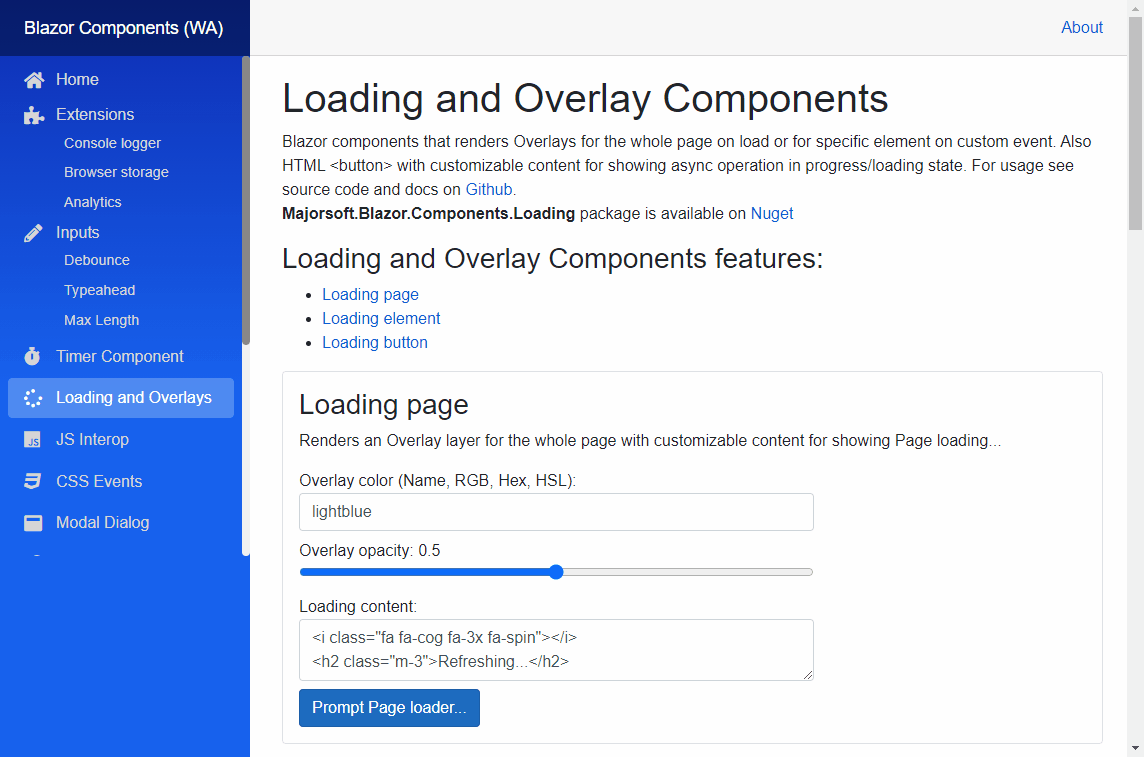
LoadingPage component (See demo app)
Renders an Overlay <div> layer with customizable background color and content for showing Page loading...
It is useful when you want to show some content with full page overlay meanwhile your page is loading (waiting API response, etc.).
Properties
LoadingContent:RenderFragmentHTML content - Required <br /> Required HTML content to show on top of the overlay<div>. Subscribe to this event and place your page initializer code to the event handler when using 'automatic' mode. Otherwise can be omitted.OverlayBackgroundColor:string { get; set; }(default: "gray") <br /> Sets thestyleof the HTML<div>background-color. Use HTML specified: Color Names, RGB, HEX or with HSL values.OverlayOpacity:double { get; set; }(default: 0.9) <br /> Opacity of the overlay<div>. Value should be between 0..1. Where 0 means the overlay layer is not visible.IsLoading:bool { get; set; }<br /> Can be set overlay to loading statetrueor remove itfalse. Returnstrueif loading overlay is prompted, otherwisefalse.
Arbitrary HTML attributes e.g.: id="load1" will be passed to the corresponding rendered HTML element <div>.
Events
OnLoading:EventCallbackdelegate <br /> Callback function called when componentOnInitializedAsyncBlazor event triggered.
Functions (OBSOLETE use IsLoading property)
Set():void Set()<br /> Sets the component to Loading state. Shows overlay<div>with specified content.Reset():void Reset()<br /> Resets the component to the original state. Hides overlay<div>.
LoadingElement component (See demo app)
Renders an Overlay <div> layer for the wrapped element (Table, Grid, etc.) with customizable content for showing loading...
It is useful when you want to show some content with overlay on a Table or Grid, etc. meanwhile data is being fetched from server.
Properties
Content:RenderFragmentHTML content - Required <br /> Required HTML content to show by default e.g: Table or Grid...LoadingContent:RenderFragmentHTML content - Required <br /> Required HTML content to show on top of theContentin an overlay<div>.OverlayBackgroundColor:string { get; set; }(default: "gray") <br /> Sets thestyleof the HTML<div>background-color. Use HTML specified: Color Names, RGB, HEX or with HSL values.OverlayOpacity:double { get; set; }(default: 0.9) <br /> Opacity of the overlay<div>. Value should be between 0..1. Where 0 means the overlay layer is not visible.IsLoading:bool { get; set; }<br /> Can be set overlay to loading statetrueor remove itfalse. Returnstrueif loading overlay is prompted, otherwisefalse.
Arbitrary HTML attributes e.g.: id="load1" will be passed to the corresponding rendered HTML element <div>.
Events
OnLoading:EventCallbackdelegate <br /> Callback function called when componentOnInitializedAsyncBlazor event triggered.OnOverlayClicked:EventCallback<MouseEventArgs>delegate <br /> Callback function called when Overlaydivwas clicked. It can be used to close the overlay.
LoadingButton component (See demo app)
Renders a HTML <button> with customizable Content and LoadingContent for showing during async operation in progress/loading...
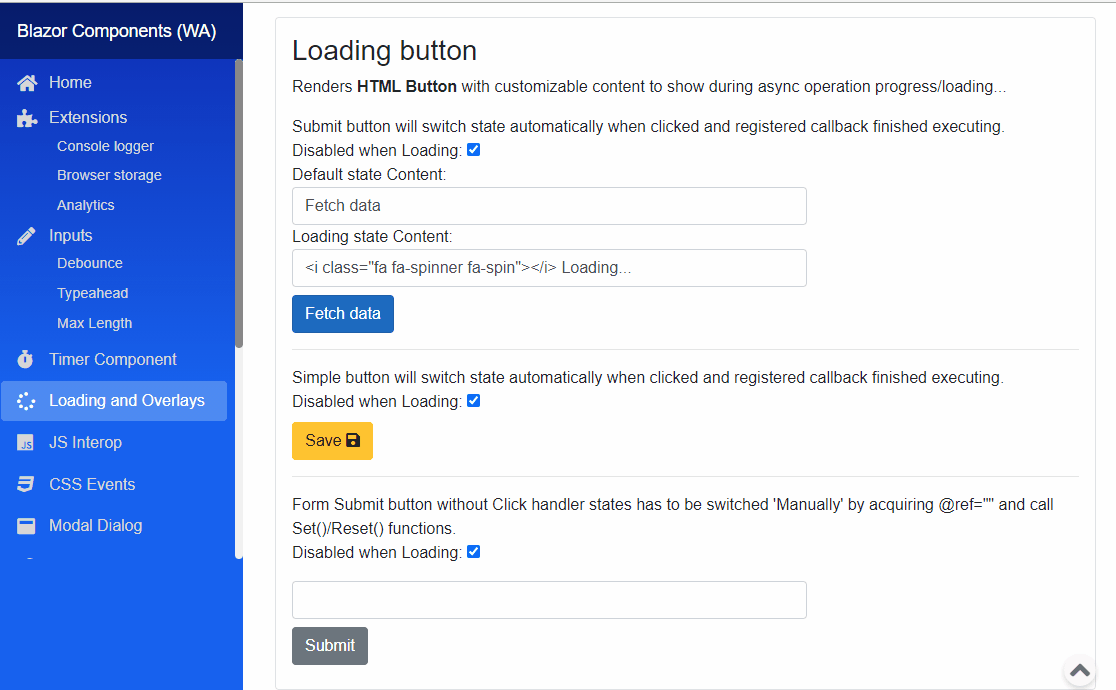
Properties
Content:RenderFragmentHTML content - Required <br /> Required HTML content to show as default<button>content.LoadingContent:RenderFragmentHTML content - Required <br /> Required HTML content to show when operation is in progress<button>is in loading state.DisabledWhenLoading:bool { get; set; }(default: true) <br /> Determines whether the button should be disabled during loading state or not.Type:ButtonTypes { get; set; }enum (default: ButtonTypes.Button) <br /> Intelisense supported type safe values to render HTML<button>type=""attribute.InnerElementReference:ElementReference { get; }<br /> Exposes a BlazorElementReferenceof the wrapped around HTML element. It can be used e.g. for JS interop, etc.IsLoading:bool { get; set; }<br /> Can be set the<button>to loading statetrueor remove itfalse. Returnstrueif button is loading, otherwisefalse.
Arbitrary HTML attributes e.g.: id="btn1" class="btn btn-primary" will be passed to the corresponding rendered HTML element <button>.
Events
OnClicked:EventCallbackdelegate <br /> Function called when componentonclickBlazor event triggered. Subscribe to this event and place your code to the event handler when using 'automatic' mode. Otherwise can be omitted.
Functions (OBSOLETE use IsLoading property)
Set():void Set()<br /> Sets the component to Loading state. Shows the specifiedLoadingContentand disables button, if configured to.Reset():void Reset()<br /> Resets the component to the original state. Shows the specified defaultContentand enables button.
Configuration
Installation
Majorsoft.Blazor.Components.Loading is available on NuGet.
dotnet add package Majorsoft.Blazor.Components.Loading
Use the --version option to specify a preview version to install.
Usage
Add using statement to your Blazor <component/page>.razor file. Or globally reference it into _Imports.razor file.
@using Majorsoft.Blazor.Components.Loading
LoadingPage usage
Following code example shows how to use LoadingPage component with 'automatic' mode in your Blazor App.
The component works by subscribing to OnInitializedAsync Blazor event. Usually all Blazor pages should subscribe to this event.
And fetch page content on that event handler e.g. by making async HTTP calls to a server.
You can skip that event registration when subscribed to OnLoading event of LoadingPage component. Just write your async method and place all initializer code here (in the code example LoadPageData()).
In this case when LoadingPage component got initialized it will show the overlay <div> with
your specified LoadingContent. Component will call your async event handler and use await to wait for method execution.
When your code run overlay will be removed from DOM.
All your code runs in Try/Finally block so you should not worry about 'infinity' loading state.
<LoadingPage OnLoading="@LoadPageData">
  <LoadingContent>
	<i class="fa fa-spinner fa-3x fa-spin"></i>
	<h2 class="m-3">Loading...</h2>
  </LoadingContent>
</LoadingPage>

@code {
  private async Task LoadPageData()
  {
	await Task.Delay(1500); //write your code here... Component uses Try/Finally internally.
  }
}
Following code example shows how to use LoadingPage component with 'manual' mode in your Blazor App.
In manual mode overlay won't be rendered on page load. Do not subscribe to the component OnLoading event.
Instead you have to show/hide overlay in your event handler e.g. OnInitializedAsync, onclick, etc.
Use bool IsLoading Blazor parameter to set the Page loader state.
OBSOLATE: Use @ref="" tag and declare LoadingPage type variable in your code with the given name in ref.
And call Set() and Reset() functions in your handler (in code example LoadForm()).
Important: you should put your code in Try/Finally block to avoid 'infinite' loading state in case of any errors.
<LoadingPage IsLoading="@_pageIsLoading" OverlayBackgroundColor="lightblue">
	<LoadingContent>
		<i class="fa fa-refresh fa-3x fa-spin"></i>
		<h2 class="m-3">Refreshing...</h2>
	</LoadingContent>
</LoadingPage>

<button class="btn btn-primary" @onclick="LoadForm">Prompt loader...</button>

@code {
	//Use it when loader should be manually triggered otherwise use LoadingPage.OnLoading event.
	private bool _pageIsLoading = false;
	private async Task LoadForm()
	{
		try
		{
			_pageIsLoading = true; //Set the layout to Loading state

			await Task.Delay(1200); //write your code here...
		}
		finally
		{
			_pageIsLoading = false; //Reset layout to default state in FINALLY block to avoid infinity loading state in case of any error!
		}
	}
}
LoadingElement usage
Following code example shows how to use LoadingElement component. Unlike other Loading components LoadingElement can only used in 'manual' mode.
In manual mode overlay won't be shown automatically.
Instead you have to show/hide overlay in your event handler e.g. OnInitializedAsync, onclick, etc.
Use bool IsLoading Blazor parameter to set the loader state.
<LoadingElement IsLoading="@_elementIsLoading" OverlayBackgroundColor="@_overlayColorTable" OverlayOpacity="@(_overlayOpacityTable/1000)">
	<LoadingContent>
		<i class="fa fa-refresh fa-3x fa-spin"></i>
		<h2 class="m-3">Refreshing...</h2>
	</LoadingContent>
	<Content>
		<table class="table table-striped table-bordered">
			<thead class="">
				<tr>
					<th>Company</th>
					<th>Contact</th>
					<th>Country</th>
				</tr>
			</thead>
			<tr>
				<td>Alfreds Futterkiste</td>
				<td>Maria Anders</td>
				<td>Germany</td>
			</tr>
			<tr>
				<td>Centro comercial Moctezuma</td>
				<td>Francisco Chang</td>
				<td>Mexico</td>
			</tr>
		</table>
	</Content>
</LoadingElement>

@code {
	private string _overlayColorTable = "orange";
	private double _overlayOpacityTable = 500;
	private bool _elementIsLoading = false;

	private async Task LoadTable()
	{
		try
		{
			_elementIsLoading = true; //Set the layout to Loading state

			await Task.Delay(1000); //write your code here...
		}
		finally
		{
			_elementIsLoading = false; //Reset layout to default state in FINALLY block to avoid infinity loading state in case of any error!
		}
	}
}
LoadingButton usage
Following code example shows how to use LoadingButton component with 'automatic' mode in your Blazor App.
The component works by subscribing to button onclick Blazor event. Component exposes this onclick via OnClicked event.
You have to subscribe to this event and specify the button default Content and LoadingContent.
In this case when LoadingButton component got clicked it will switch state and content. Also will be disabled if configured to.
Component will call your async event handler and use await to wait for method execution.
When your code run default content will be shown and button becomes enabled again.
All your code runs in Try/Finally block so you should not worry about 'infinity' loading state.
<LoadingButton class="btn btn-primary" Type="ButtonTypes.Button" OnClicked="@SendRequest">
		<Content>
			Fetch data
		</Content>
		<LoadingContent>
			<i class="fa fa-spinner fa-spin"></i> Loading...
		</LoadingContent>
	</LoadingButton>

@code {
	private async Task SendRequest()
	{
		await Task.Delay(1500); //write your code here... Component uses Try/Finally internally.
	}
}
Following code example shows how to use LoadingButton component with 'manual' mode in your Blazor App. (It is the only option when using it in EditForm)
In manual mode button state and content won't be changed when clicked. Do not subscribe to the component OnClicked event.
Instead you have to switch button state in your event handler most probably in a form validation events e.g. OnValidSubmit, etc.
Use bool IsLoading Blazor parameter to set the Page loader state.
OBSOLATE: Use @ref="" tag and declare LoadingButton type variable in your code with the given name in ref.
And call Set() and Reset() functions in your handler (in code example FormOnValidSubmit()).
Important: you should put your code in Try/Finally block to avoid 'infinite' loading state in case of any errors.
<EditForm Model="@exampleModel" OnValidSubmit="@FormOnValidSubmit">
  <DataAnnotationsValidator />
  <ValidationSummary />

  <div class="pb-2">
	<InputText @bind-Value="exampleModel.Name" class="form-control w-25" />
  </div>
  <div class="pb-2">
	<LoadingButton IsLoading="@_isButtonLoading" class="btn btn-secondary" Type="ButtonTypes.Submit">
	  <Content>
		Submit
	  </Content>
	  <LoadingContent>
		<i class="fa fa-circle-o-notch fa-spin"></i> Loading...
	  </LoadingContent>
	</LoadingButton>
  </div>
</EditForm>

@code {
  //Use it with EditForm otherwise use LoadingButton.OnClicked event.
	private bool _isButtonLoading = false;
	private async Task FormOnValidSubmit()
	{
		try
		{
			_isButtonLoading = true; //Set the button to Loading state

			await Task.Delay(1500); //write your code here...
		}
		finally
		{
			_isButtonLoading = false; //Reset button to default state in FINALLY block to avoid infinity loading state in case of any error!
		}
	}

	//Form model
	private ExampleModel exampleModel = new ExampleModel();
	public class ExampleModel
	{
		[Required]
		public string Name { get; set; }
	}
}
| Product | Versions Compatible and additional computed target framework versions. |
|---|---|
| .NET | net8.0 is compatible. net8.0-android was computed. net8.0-browser was computed. net8.0-ios was computed. net8.0-maccatalyst was computed. net8.0-macos was computed. net8.0-tvos was computed. net8.0-windows was computed. net9.0 is compatible. net9.0-android was computed. net9.0-browser was computed. net9.0-ios was computed. net9.0-maccatalyst was computed. net9.0-macos was computed. net9.0-tvos was computed. net9.0-windows was computed. net10.0 is compatible. net10.0-android was computed. net10.0-browser was computed. net10.0-ios was computed. net10.0-maccatalyst was computed. net10.0-macos was computed. net10.0-tvos was computed. net10.0-windows was computed. |
-
net10.0
- Microsoft.AspNetCore.Components.Web (>= 10.0.8)
-
net8.0
- Microsoft.AspNetCore.Components.Web (>= 8.0.27)
-
net9.0
- Microsoft.AspNetCore.Components.Web (>= 9.0.16)
NuGet packages
This package is not used by any NuGet packages.
GitHub repositories
This package is not used by any popular GitHub repositories.
| Version | Downloads | Last Updated |
|---|---|---|
| 2.2.0 | 117 | 7/7/2026 |
| 2.1.0 | 155 | 5/27/2026 |
| 2.0.0 | 217 | 5/19/2026 |
| 1.6.1 | 231 | 3/27/2026 |
| 1.6.0 | 138 | 3/26/2026 |
| 1.5.0 | 24,749 | 8/27/2021 |
| 1.4.0 | 698 | 7/15/2021 |
| 1.3.0 | 1,329 | 3/10/2021 |
| 1.2.0 | 751 | 1/5/2021 |
| 1.1.0 | 670 | 12/18/2020 |
| 1.0.1 | 703 | 11/30/2020 |
| 1.0.0 | 686 | 11/11/2020 |
| 0.9.52-rc.2.20479.15 | 458 | 10/30/2020 |
| 0.9.50-rc.2.20479.15 | 435 | 10/27/2020 |
See Releases here: https://github.com/majorimi/blazor-components/releases