Dirkster.SuggestBoxLib
1.1.1
See the version list below for details.
dotnet add package Dirkster.SuggestBoxLib --version 1.1.1
NuGet\Install-Package Dirkster.SuggestBoxLib -Version 1.1.1
<PackageReference Include="Dirkster.SuggestBoxLib" Version="1.1.1" />
paket add Dirkster.SuggestBoxLib --version 1.1.1
#r "nuget: Dirkster.SuggestBoxLib, 1.1.1"
// Install Dirkster.SuggestBoxLib as a Cake Addin #addin nuget:?package=Dirkster.SuggestBoxLib&version=1.1.1 // Install Dirkster.SuggestBoxLib as a Cake Tool #tool nuget:?package=Dirkster.SuggestBoxLib&version=1.1.1
The SuggestBox control in this repository was originally developed by <b>Leung Yat Chun Joseph <a href="https://github.com/lycj">lycj</a></b> in his FileExplorer application originating from CodePlex and <a href="https://www.codeproject.com/Members/Fainx">CodeProject</a>.
SuggestBoxLib
<h2><img src="https://raw.githubusercontent.com/Dirkster99/Docu/master/SuggestBoxLib/icons/AutoComplete_64x.png" height="64"/> Overview</h2>
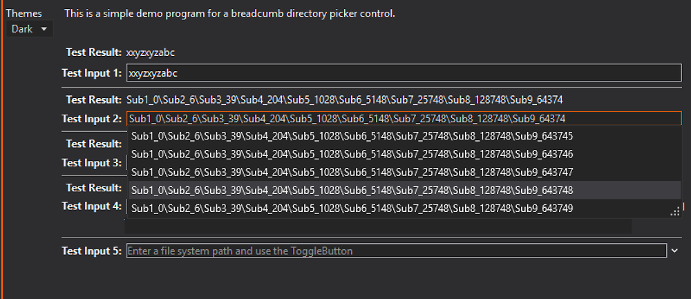
A WPF Dark/Light AutoComplete TextBox that can easily handle 20.000+ entries.
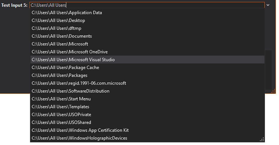
This project implements a WPF Dark/Light AutoComplete TextBox that can easily handle 20.000+ entries in the list of suggestions. The screenshots below show a dark themed demo appliaction with a classic AutoComplete use case for browsing the file system. This control can also be used to browse other data structures since the data processing is implemented in the ViewModel/Model layers of the MVVM demo app, while the control itself is limited to the view.
Review the Wiki section to find out more details of the available API.
This control is also used in a Metro Breadcrumb control.
The first two screenshots show how a seperate combobox like drop down control can be used to select an entry from
a list of recently visited locations (bound to a collection in the viewmodel):


A selection of a recently visited location can be used as a starting point to follow up with more suggestions:


User Feedback
The control implements a NextTargetLocationArgs event that can be raised via enter/escape key in the textbox control to support keyboard gestures to confirm/cancel editing of a location.

Error Feedback
The control can show a red rectangle if the user types a completely unmatchable string. This red rectangle can be triggered with the property attached to the checkbox in the demo application.

Highlighting Color and Themes
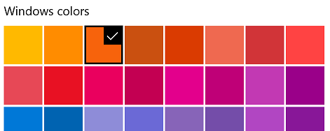
Screenshot in this repository where done with this highlighting color on Windows 10:

Load Light or Dark brush resources in you resource dictionary to take advantage of existing definitions.
    <ResourceDictionary.MergedDictionaries>
        <ResourceDictionary Source="/SuggestBoxLib;component/Themes/DarkBrushes.xaml" />
    </ResourceDictionary.MergedDictionaries>
    <ResourceDictionary.MergedDictionaries>
        <ResourceDictionary Source="/SuggestBoxLib;component/Themes/LightBrushes.xaml" />
    </ResourceDictionary.MergedDictionaries>
These definitions do not theme all controls used within this library. You should use a standard theming library, such as:
- MahApps.Metro,
- MLib, or
- MUI
to also theme standard elements, such as, button and textblock etc.
A Dark/Light themed demo application and a Generic application are part of this repository.

| Product | Versions Compatible and additional computed target framework versions. |
|---|---|
| .NET Framework | net452 is compatible. net46 was computed. net461 was computed. net462 was computed. net463 was computed. net47 was computed. net471 was computed. net472 was computed. net48 was computed. net481 was computed. |
This package has no dependencies.
NuGet packages (1)
Showing the top 1 NuGet packages that depend on Dirkster.SuggestBoxLib:
| Package | Downloads |
|---|---|
|
WolvenKit.ExplorerControl
Provides a WPF/MVVM AutoComplete control |
GitHub repositories
This package is not used by any popular GitHub repositories.
Added trimed text display with ellipses center, left, and right (perf optimized).

