Majorsoft.Blazor.Components.Toggle
1.6.1
dotnet add package Majorsoft.Blazor.Components.Toggle --version 1.6.1
NuGet\Install-Package Majorsoft.Blazor.Components.Toggle -Version 1.6.1
<PackageReference Include="Majorsoft.Blazor.Components.Toggle" Version="1.6.1" />
<PackageVersion Include="Majorsoft.Blazor.Components.Toggle" Version="1.6.1" />
<PackageReference Include="Majorsoft.Blazor.Components.Toggle" />
paket add Majorsoft.Blazor.Components.Toggle --version 1.6.1
#r "nuget: Majorsoft.Blazor.Components.Toggle, 1.6.1"
#:package Majorsoft.Blazor.Components.Toggle@1.6.1
#addin nuget:?package=Majorsoft.Blazor.Components.Toggle&version=1.6.1
#tool nuget:?package=Majorsoft.Blazor.Components.Toggle&version=1.6.1
Blazor Toggle Components


About
Blazor component that renders customizable Toggle Switch and Toggle Button components. All components work with WebAssembly and Server hosted models. For code examples see usage.
You can try it out by using the demo app.
Components
ToggleSwitch: Renders HTML<input>styled as Toggle switch with customizable size and color, etc.ToggleButton: Renders HTML<button>styled as Toggle button with custom content and customizable size, color, etc.ToggleButtonGroup: Renders a container for HTML<button>styled as Toggle button with custom content and customizable size, color, etc. Also allows only one toggle button to be Checked.
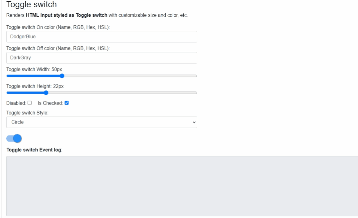
ToggleSwitch component (See: demo app)
Blazor component to represent a boolean value as an ON/OFF toggle switch.
Properties
Checked:bool { get; set; }(default: true) - Required <br /> Represents Toggle switch value: ON:true, OFF:false.OnColor:string { get; set; }(default: "blue") - Required <br /> Sets thestyleof the HTML<input>background-colorwhen switch is ON (bool valuetrue). Use HTML specified: Color Names, RGB, HEX or with HSL values.OffColor:string { get; set; }(default: "darkgray") - Required <br /> Sets thestyleof the HTML<input>background-colorwhen switch is OFF (bool valuefalse). Use HTML specified: Color Names, RGB, HEX or with HSL values.Height:int { get; set; }(default: 30) - Required <br /> HTML<input>element height inpx.Width:int { get; set; }(default: 80) - Required <br /> HTML<input>element width inpx.Disabled:bool { get; set; }(default: false) <br /> Determines whether the rendered HTML<input>element should be disabled or not.HandleStyle:ToggleSwitchStyle { get; set; }(default: ToggleSwitchStyle.Circle) <br /> Renders Toggle switch handle with different shaped styles.{ Ellipse, Circle, Square }InnerElementReference:ElementReference { get; }<br /> Exposes a BlazorElementReferenceof the wrapped around HTML element. It can be used e.g. for JS interop, etc.
Arbitrary HTML attributes e.g.: tabindex="1" will be passed to the corresponding rendered HTML element <input>.
Events
OnToggleChanged:EventCallback<bool>delegate <br /> Callback function called when component toggled. Actual toggleValueis the callbackboolparameter.
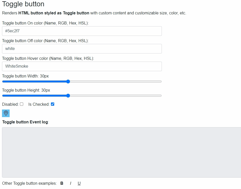
ToggleButton component (See: demo app)
Blazor component to represent a boolean value as an ON/OFF toggle switch as a button and custom content.
Properties
Content:RenderFragmentHTML content - Required Required HTML content to show in Toggle button. It can be any text or image (please use transparent background image).Checked:bool { get; set; }(default: true) - Required <br /> Represents Toggle button value: ON:true, OFF:false.OnColor:string { get; set; }(default: "white") - Required <br /> Sets thestyleof the HTML<button>background-colorwhen button is ON (bool valuetrue). Use HTML specified: Color Names, RGB, HEX or with HSL values.OffColor:string { get; set; }(default: "lightgray") - Required <br /> Sets thestyleof the HTML<button>background-colorwhen button is OFF (bool valuefalse). Use HTML specified: Color Names, RGB, HEX or with HSL values.HoverColor:string { get; set; }(default: "whitesmoke") - Required <br /> Sets thestyleof the HTML<button>background-colorwhen button is hovered over with mouse. Use HTML specified: Color Names, RGB, HEX or with HSL values.Height:int { get; set; }(default: 30) - Required <br /> HTML<button>element height inpx.Width:int { get; set; }(default: 80) - Required <br /> HTML<button>element width inpx.Disabled:bool { get; set; }(default: false) <br /> Determines whether the rendered HTML<button>element should be disabled or not.InnerElementReference:ElementReference { get; }<br /> Exposes a BlazorElementReferenceof the wrapped around HTML element. It can be used e.g. for JS interop, etc.
Events
OnToggleChanged:EventCallback<bool>delegate <br /> Callback function called when component toggled. Actual toggleValueis the callbackboolparameter.
Arbitrary HTML attributes e.g.: tabindex="1" will be passed to the corresponding rendered HTML element <input>.
ToggleButtonGroup component (See: demo app)
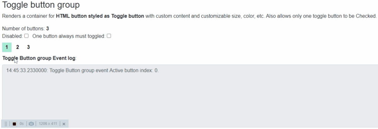
Properties
ToggleButtons:RenderFragmentHTML content - Required Required list of ToggleButtons components. See usage example.ActiveButton:ToggleButton? { get; set; }(default: NULL) Returns currently active "toggled" button element ref also can be used to set which button should be active "toggled".Buttons:IEnumerable<ToggleButton> { get; }Returns all theToggleButtonreference added to the group. It can be used for activating any of the elements.ButtonCount:int { get; }Returns the number ofToggleButtonint the givenToggleButtonGroup.MustToggled:bool { get; set; }(default: false) <br /> Determines whether at least one ToggleButton must be toggled all the time or all buttons can be Off.Disabled:bool { get; set; }(default: false) <br /> Determines whether all the rendered HTML<button>elements should be disabled or not.InnerElementReference:ElementReference { get; }<br /> Exposes a BlazorElementReferenceof the wrapped around HTML element. It can be used e.g. for JS interop, etc.
Events
OnToggleChanged:EventCallback<ToggleButton>delegate <br /> Callback function called when component toggled. Actual toggled (selected) button is the callback parameter. When nothing selected value isNULL.
Arbitrary HTML attributes e.g.: tabindex="1" will be passed to the corresponding rendered HTML element <input>.
Configuration
Installation
Majorsoft.Blazor.Components.Toggle is available on NuGet.
dotnet add package Majorsoft.Blazor.Components.Toggle
Use the --version option to specify a preview version to install.
Usage
Add using statement to your Blazor <component/page>.razor file. Or globally reference it into _Imports.razor file.
@using Majorsoft.Blazor.Components.Toggle
ToggleSwitch usage
Following code example shows how to use ToggleSwitch component in your Blazor App.
<ToggleSwitch
	@ref="_toggleSwitch"
	Checked="_value"
	OnColor="@_onColor"
	OffColor="@_offColor"
	Width="_widht"
	Height="_height"
	HandleStyle="_styleType"
	Disabled="_disabled"
	OnToggleChanged="OnToggleSwitched">
</ToggleSwitch>

@code {
	private ToggleSwitch _toggleSwitch;
	protected override async Task OnAfterRenderAsync(bool firstRender)
	{
		if (firstRender)
		{
			await _toggleSwitch.InnerElementReference.FocusAsync();
		}
	}

	private string _onColor = "DodgerBlue";
	private string _offColor = "DarkGray";
	private int _widht = 50;
	private int _height = 22;
	private bool _value = true;
	private bool _disabled = false;
	private ToggleSwitchStyle _styleType = ToggleSwitchStyle.Circle;

	private ElementReference log1;
	private string _swithch1Log;

	private async Task OnToggleSwitched(bool val)
	{
		_value = val;
	}
}
ToggleButton usage
Following code example shows how to use ToggleButton component in your Blazor App.
<ToggleButton @ref="_toggleButton"
				Checked="@_isButtonChecked"
				OnColor="@_buttonOnColor"
				OffColor="@_buttonOffColor"
				HoverColor="@_buttonHoverColor"
				Width="@_buttonWidth"
				Height="@_buttonHeight"
				Disabled="@_buttonDisabled"
				OnToggleChanged="OnToggleClicked">
	<Content>
		<img src="https://raw.githubusercontent.com/majorimi/blazor-components/master/src/Blazor.Components.TestApps.Common/wwwroot/place-marker.png" width="@(_buttonWidth - 5)px" height="@(_buttonHeight - 5)px" />
	</Content>
</ToggleButton>

<ToggleButton>
	<Content><strong>B</strong></Content>
</ToggleButton>
<ToggleButton>
	<Content><i>I</i></Content>
</ToggleButton>
<ToggleButton>
	<Content><u>U</u></Content>
</ToggleButton>

@code {
	protected override async Task OnAfterRenderAsync(bool firstRender)
	{
		if (firstRender)
		{
			await _toggleButton.InnerElementReference.FocusAsync();
		}
	}

	//Button
	private ToggleButton _toggleButton;

	private string _buttonOnColor = "lightGray";
	private string _buttonOffColor = "white";
	private string _buttonHoverColor = "WhiteSmoke";
	private int _buttonWidth = 30;
	private int _buttonHeight = 30;
	private bool _isButtonChecked = true;
	private bool _buttonDisabled = false;

	private async Task OnToggleClicked(bool val)
	{
		_isButtonChecked = val;
	}
}
ToggleButtonGroup usage
Following code example shows how to use ToggleButtonGroup component in your Blazor App.
@*ToggleButtons can be configured as regular ToggleButton*@
<ToggleButtonGroup @ref="_btnGroup" MustToggled="_mustToggled" OnToggleChanged="OnToggleGroupClicked"
			Disabled="@_buttonGroupDisabled" ActiveButton="@_activeButton">
	<ToggleButtons>
		<ToggleButton @ref="_btn1">
			<Content><strong>1</strong></Content>
		</ToggleButton>
		<ToggleButton @ref="_btn2">
			<Content><strong>2</strong></Content>
		</ToggleButton>
		<ToggleButton @ref="_btn3">
			<Content><strong>3</strong></Content>
		</ToggleButton>
	</ToggleButtons>
</ToggleButtonGroup>

@code {
	protected override async Task OnAfterRenderAsync(bool firstRender)
	{
		if (firstRender)
		{
			_activeButton = _btn1;
			_btnCount = _btnGroup.ButtonCount;
			StateHasChanged();
		}
	}

	private ToggleButtonGroup _btnGroup;
	private ToggleButton _activeButton;
	private ToggleButton _btn1;
	private ToggleButton _btn2;
	private ToggleButton _btn3;
	private bool _buttonGroupDisabled = false;
	private bool _mustToggled = false;
	private int _btnCount = 0;

	private ElementReference _log3;
	private string _buttonGroupLog;

	private async Task OnToggleGroupClicked(ToggleButton active)
	{
		_activeButton = active;
		var index = _btnGroup.Buttons.ToList().IndexOf(active);
	}
}
| Product | Versions Compatible and additional computed target framework versions. |
|---|---|
| .NET | net5.0 is compatible. net5.0-windows was computed. net6.0 was computed. net6.0-android was computed. net6.0-ios was computed. net6.0-maccatalyst was computed. net6.0-macos was computed. net6.0-tvos was computed. net6.0-windows was computed. net7.0 was computed. net7.0-android was computed. net7.0-ios was computed. net7.0-maccatalyst was computed. net7.0-macos was computed. net7.0-tvos was computed. net7.0-windows was computed. net8.0 was computed. net8.0-android was computed. net8.0-browser was computed. net8.0-ios was computed. net8.0-maccatalyst was computed. net8.0-macos was computed. net8.0-tvos was computed. net8.0-windows was computed. net9.0 was computed. net9.0-android was computed. net9.0-browser was computed. net9.0-ios was computed. net9.0-maccatalyst was computed. net9.0-macos was computed. net9.0-tvos was computed. net9.0-windows was computed. net10.0 was computed. net10.0-android was computed. net10.0-browser was computed. net10.0-ios was computed. net10.0-maccatalyst was computed. net10.0-macos was computed. net10.0-tvos was computed. net10.0-windows was computed. |
-
net5.0
- Microsoft.AspNetCore.Components.Web (>= 5.0.3)
NuGet packages (1)
Showing the top 1 NuGet packages that depend on Majorsoft.Blazor.Components.Toggle:
| Package | Downloads |
|---|---|
|
Majorsoft.Blazor.Components.GdprConsent
Blazor Components by Imre Toth |
GitHub repositories
This package is not used by any popular GitHub repositories.
See Releases here: https://github.com/majorimi/blazor-components/releases