Sebarslan.Maui.NullableDateTimePicker
3.0.0
dotnet add package Sebarslan.Maui.NullableDateTimePicker --version 3.0.0
NuGet\Install-Package Sebarslan.Maui.NullableDateTimePicker -Version 3.0.0
<PackageReference Include="Sebarslan.Maui.NullableDateTimePicker" Version="3.0.0" />
<PackageVersion Include="Sebarslan.Maui.NullableDateTimePicker" Version="3.0.0" />
<PackageReference Include="Sebarslan.Maui.NullableDateTimePicker" />
paket add Sebarslan.Maui.NullableDateTimePicker --version 3.0.0
#r "nuget: Sebarslan.Maui.NullableDateTimePicker, 3.0.0"
#addin nuget:?package=Sebarslan.Maui.NullableDateTimePicker&version=3.0.0
#tool nuget:?package=Sebarslan.Maui.NullableDateTimePicker&version=3.0.0
Maui Nullable and Clearable DateTimePicker
The Nullable DateTimePicker is a custom calendar control for selecting a nullable date and time value in a .NET MAUI application. It provides a consistent and platform-independent user interface for selecting dates, and allows the user to clear the value if needed.
This control uses the <a href="https://github.com/CommunityToolkit/Maui" target="_blank">CommunityToolkit.Maui</a> Popup
Usage
To use the Nullable DateTimePicker control in your .NET MAUI application, follow these steps:
0- Add the Sebarslan.Maui.NullableDateTimePicker nuget package to your project and add the .ConfigureNullableDateTimePicker() element to the MauiProgram.cs file in your project.
<pre> <code> public static MauiApp CreateMauiApp() { var builder = MauiApp.CreateBuilder() .UseMauiApp<App>() .ConfigureNullableDateTimePicker() .... </code> </pre>
Usage 1: Use DateTimePicker as ContentView control (With input field and icon)
1- Add the NullableDateTimePicker control to your XAML layout file:
xmlns:ndtp="clr-namespace:Maui.NullableDateTimePicker;assembly=Maui.NullableDateTimePicker" <pre> <code> <ContentPage xmlns="http://schemas.microsoft.com/dotnet/2021/maui" xmlns:x="http://schemas.microsoft.com/winfx/2009/xaml" xmlns:ndtp="clr-namespace:Maui.NullableDateTimePicker;assembly=Maui.NullableDateTimePicker" x:Class="Maui.NullableDateTimePicker.Samples.MainPage"> </code> </pre>
2- And add the following code to the place where you want to use DateTimePicker and then connect the NullableDateTime property with the Datetime Property in your ViewModel. <pre> <code> <ndtp:NullableDateTimePicker NullableDateTime="{Binding MyDateTime}" Mode="Date" /> </code> </pre>
Usage 2: Use direct calendar popup with your own entry and button
1- Add your entry and button for datetime in your xaml page (eg. MainPage.xaml) <pre> <code> <HorizontalStackLayout HorizontalOptions="Fill" HeightRequest="40"> <Entry x:Name="DateTimeEntry" Text="{Binding MyDateTime, StringFormat='{0:g}'}" HorizontalOptions="Fill" VerticalOptions="Fill" IsReadOnly="True" /> <ImageButton Source="{Binding CalendarIcon}" Clicked="DateTimePicker_Clicked" Margin="0" Padding="2" WidthRequest="30" /> </HorizontalStackLayout> </code> </pre>
2- Then, when you click on the button or entry, define the options and call NullableDateTimePicker.OpenAsync(options) to open the calendar in your xaml.cs file. (eg. MainPage.xaml.cs) <pre> <code> private async void DateTimePicker_Clicked(object sender, EventArgs e) { INullableDateTimePickerOptions nullableDateTimePickerOptions = new NullableDateTimePickerOptions { NullableDateTime = MyDateTime, Mode = PickerModes.DateTime, ShowWeekNumbers = true // .. other calendar options };
var result = await NullableDateTimePicker.OpenAsync(nullableDateTimePickerOptions);
if (result is PopupResult popupResult && popupResult.ButtonResult != PopupButtons.Cancel)
{
    MyDateTime = popupResult.NullableDateTime;
    // DateTimeEntry.Text = popupResult.NullableDateTime?.ToString("g"); //If you are not using ViewModel
}
} </code> </pre>
More examples, please see the samples project
Options
DateTimePicker Calendar options
| Option | Description | Default Value |
|---|---|---|
| AutomationId | You can give your own automation id. With this you can access Calendar elements. Example: {Your-AutomationId}_CalendarYearsPicker, {Your-AutomationId}_CalendarOkButton | empty |
| BodyBackgroundColor | Background color of the calendar. | White |
| CancelButtonText | The text for the Cancel button. | Cancel |
| ClearButtonText | Gets or sets the text for the Clear button. | Clear |
| DayNamesStyle | Style of the day names in the calendar. | null |
| DayStyle | Style of the days in the calendar. | null |
| DisabledDayStyle | Style of the disabled days in the calendar. | null |
| ForeColor | It is used for the color of texts that cannot be styled in the calendar. | Dark:White, Light:Black |
| HeaderBackgroundColor | Background color of the calendar's header. | #2b0b98 |
| HeaderForeColor | Gets or sets the foreground color of the control's header. | White |
| Is12HourFormat | Determines whether to display the am/pm picker for the 12-hour format. | false |
| MaxDate | Maximum selectable date of the control. | DateTime.MaxValue |
| MinDate | Minimum selectable date of the control. | DateTime.MinValue |
| Mode | Specifies the picker mode of the control. Valid values are Date, DateTime, and Time. | Date |
| NullableDateTime | Gets or sets the nullable date and time value of the control. | null |
| OkButtonText | The text for the OK button. | OK |
| OtherMonthDayStyle | Style of the other month days in the calendar. | null |
| PopupBorderColor | Color of the popup border. Set to transparent or null to hide the border. | Transparent |
| PopupCornerRadius | Corner radius of the popup's border for rounded edge appearance. | 0 |
| PopupBorderWidth | Thickness of the border around the popup. | 0 |
| PopupPadding | Internal spacing between the popup's content and its border. | 0 |
| PopupPageOverlayColor | Background overlay color behind the popup. Useful for dimming the content. | Black, %50 opacity [Colors.Black.WithAlpha(0.5f)] |
| SelectedDayStyle | Style of the selected day in the calendar. | null |
| ShowClearButton | Clear button can be hidden/shown. If true, the button is displayed. | true |
| ShowOtherMonthDays | Determines whether to display other month days in the calendar. | true |
| ShowWeekNumbers | Determines whether to display week numbers in the calendar. | false |
| ToolButtonsStyle | Style of the control's tool buttons. | null |
| WeekNumberStyle | Style of the week numbers in the calendar. | null |
Datetimepicker Input Options (If NullableDateTimePicker is used as ContentView)
| Option | Description | Default Value |
|---|---|---|
| BackgroundColor | Background color of the datetimepicker control. | White |
| BorderColor | Border color of the datetimepicker control | none |
| BorderWidth | Border width of the control | 0 |
| CornerRadius | Corner radius of the control | 0 |
| FontFamily | Font family of the entry. | OpenSansRegular |
| FontSize | Font size of the entry. | 14 |
| Format | Specifies the display format for the date or time. | for date: d, for datetime: g, for time: t |
| HideIcon | Determines whether to show or hide the calendar icon. | false |
| Icon | Imagesource for the icon. | null |
| PlaceHolder | Placeholder of the entry | empty |
| PlaceHolderColor | Placeholder color of the entry | Gray |
| TextColor | Text color of the entry. | Black |
NullableDateTimeChanged Event (If NullableDateTimePicker is used as ContentView)
The NullableDateTimeChanged event is used to indicate when a NullableDateTime value has been changed. This event is commonly used in programming or software environments and is triggered when the NullableDateTime value is modified.
The event utilizes the DateTimeChangedEventArgs class as its argument. The DateTimeChangedEventArgs class contains additional information that is carried at the moment the event is triggered. It may include details about the date and time change, such as the old DateTime value and the new DateTime value.
Below is an example code snippet illustrating the usage of the "NullableDateTimeChanged" event and the "DateTimeChangedEventArgs" argument class: <pre> <code> NullableDateTimePicker dateTimePicker = new NullableDateTimePicker(); dateTimePicker.NullableDateTimeChanged += OnNullableDateTimeChanged;
private static void OnNullableDateTimeChanged(object sender, DateTimeChangedEventArgs e) { Console.WriteLine("DateTime changed!"); Console.WriteLine("Old DateTime: " + e.OldDateTime); Console.WriteLine("New DateTime: " + e.NewDateTime); } </code> </pre>
.NET MAUI handler was used in the test project to remove the underline in the original entry. Please refer to the MauiProgram.cs file in the sample project. For more detailed information about handlers, please check: https://learn.microsoft.com/en-us/dotnet/maui/user-interface/handlers/customize?view=net-maui-8.0
License
The Nullable DateTimePicker control is licensed under the MIT License. See <a href="LICENSE.txt">LICENSE file</a> for more information.
Contributing
Contributions are welcome!
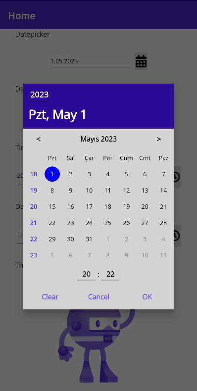
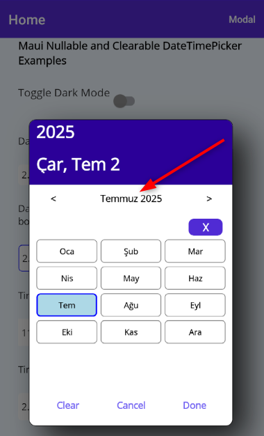
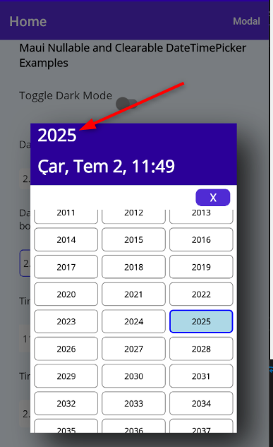
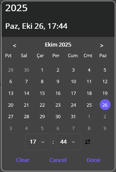
Screenshot
on ios, android, windows
Changelog
3.0.0
- OpenSansRegular was used instead of arial font for FontFamilyProperty (Thanks @VitaliBalyk)
- Added new version of .NET MAUI Communitytoolkit (12.0.0)
- Added a graphical clock so hours and minutes can be selected.
- In Time mode, the graphic clock is displayed instead of the calendar. In DateTime mode, you can switch between the calendar and the graphic clock.
- net8.0 support removed
- Automation-Ids have been renamed
- Added popup corner rounding and shadow and border properties. (Thanks @sferhah)
- Static method OpenCalendarAsync changed to Maui.NullableDateTimePicker.OpenAsync.
- In the 24-hour format, hours start with '00'.
2.4.1 (skipped)
- Since CommunityToolkit Popup does not work on modal pages in windows, Mopup-Library is used temporarily in windows. (Thanks @sferhah)
2.4.0
- Added HideIcon property
- You can access calendar elements by providing your own AutomationId.
- Net 9.0 compatibility
- net7.0 support removed
- Added new version of .NET MAUI Communitytoolkit
- A new select list is created for years and months and the scroll bar is moved to the selected year.
2.3.1
- Fixed issue: Icons displayed inconsistently
2.3.0
- Setting TextColor had no effect.
- FontFamily added.
- Fixed am/pm picker issue in windows
2.2.0
- 12 hour format added (AM/PM picker)
- Time icon fixed
- The calendar can also be opened by clicking on the entry.
- In time picker, only time is shown in the header
- Various improvements.
2.1.0
- Fixed: Content is already a child of Microsoft.Maui.Controls.ContentPage.
- Fixed: When the months were changed in Windows, the application would hang.
2.0.0
- Layout adjustments
- Fixed: The months list was opening in Time mode.
- If the months list is open, the year changes with the next/previous button.
- Default height: 40
- Net 8.0 compatibility
1.2.0
- Months can be quickly selected from the list.
- MinDate and MaxDate validations have been reviewed and revised.
- A border and CornerRadius has been added to the datetimepicker control.
1.1.1
- The .NET MAUI Communitytoolkit version (6.1.0) was added to the project.
- Updated the week number logic to align with ISO 8601 standards.
- Bug fixed: When going back from the 1st month, the year was also decreased.
1.1.0
- The calendar popup can be opened directly via the NullableDateTimePicker, so you can use your own entry and button.
- On some screens, week and day numbers were not displayed on the same line.
- Dark theme adjusted
- Various bugs fixed
1.0.2
The problem of displaying the default icon in default mode has been fixed.
Various improvements.
1.0.1
- The problem of not setting the margin has been fixed.
| Product | Versions Compatible and additional computed target framework versions. |
|---|---|
| .NET | net9.0 is compatible. net9.0-android was computed. net9.0-browser was computed. net9.0-ios was computed. net9.0-maccatalyst was computed. net9.0-macos was computed. net9.0-tvos was computed. net9.0-windows was computed. net10.0 was computed. net10.0-android was computed. net10.0-browser was computed. net10.0-ios was computed. net10.0-maccatalyst was computed. net10.0-macos was computed. net10.0-tvos was computed. net10.0-windows was computed. |
-
net9.0
- CommunityToolkit.Maui (>= 12.0.0)
NuGet packages
This package is not used by any NuGet packages.
GitHub repositories
This package is not used by any popular GitHub repositories.