Toolbelt.Blazor.FileDropZone
2.0.0
See the version list below for details.
dotnet add package Toolbelt.Blazor.FileDropZone --version 2.0.0
NuGet\Install-Package Toolbelt.Blazor.FileDropZone -Version 2.0.0
<PackageReference Include="Toolbelt.Blazor.FileDropZone" Version="2.0.0" />
paket add Toolbelt.Blazor.FileDropZone --version 2.0.0
#r "nuget: Toolbelt.Blazor.FileDropZone, 2.0.0"
// Install Toolbelt.Blazor.FileDropZone as a Cake Addin #addin nuget:?package=Toolbelt.Blazor.FileDropZone&version=2.0.0 // Install Toolbelt.Blazor.FileDropZone as a Cake Tool #tool nuget:?package=Toolbelt.Blazor.FileDropZone&version=2.0.0
Blazor File Drop Zone 
Summary
Surround an <input type=file> element by this <FileDropZone> Blazor component to making a zone that accepts drag and drops files.
- Live demo site - https://jsakamoto.github.io/Toolbelt.Blazor.FileDropZone/
Usage
Step 1. Add the NuGet package of this Blazor component to your Blazor app project.
> dotnet add package Toolbelt.Blazor.FileDropZone
Step 2. Surround <InputFile> component by the <FileDropZone> component.
Before:
<InputFile OnChange="OnInputFileChange" />
After:
@using Toolbelt.Blazor.FileDropZone
...
<FileDropZone class="drop-zone">

  <InputFile OnChange="OnInputFileChange" />

</FileDropZone>
Step 3. Styling the <FileDropZone> component as you want to see.
[Tips]
The <FileDropZone> component will render just a single & plain <div> element outside of child content.
That means the <FileDropZone> component doesn't provide any UI styles.
Instead, <FileDropZone> the component adds/removes the "hover" CSS class to that <div> element when the mouse cursor enters/leaves the component area.
/* "Foo.razor.css" */

::deep .drop-zone {
    padding: 32px;
    border: dashed 2px transparent;
    transition: border linear 0.2s;
}
::deep .drop-zone.hover {
    border: dashed 2px darkorange;
}
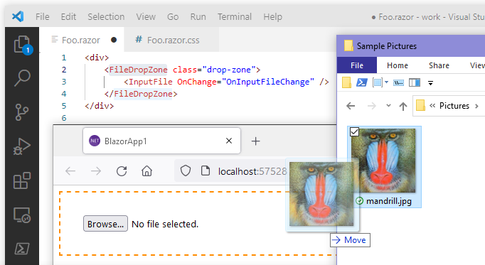
After doing the above steps, you will get a drag & drop file feature like the following image.
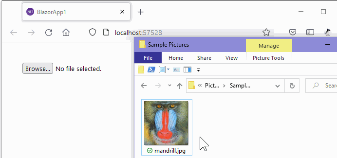
When any files are dropped into the div element that the <FileDropZone> component rendered, the <FileDropZone> component finds a <input type=file> element from an inside of its child content.
And then, the component dispatches the file object that the user dropped to the input element that the component found.
Supported version
- .NET 5 or later is required.
- Both Blazor WebAssembly and Blazor Server are supported.
Release Note
License
| Product | Versions Compatible and additional computed target framework versions. |
|---|---|
| .NET | net5.0 is compatible. net5.0-windows was computed. net6.0 is compatible. net6.0-android was computed. net6.0-ios was computed. net6.0-maccatalyst was computed. net6.0-macos was computed. net6.0-tvos was computed. net6.0-windows was computed. net7.0 was computed. net7.0-android was computed. net7.0-ios was computed. net7.0-maccatalyst was computed. net7.0-macos was computed. net7.0-tvos was computed. net7.0-windows was computed. net8.0 was computed. net8.0-android was computed. net8.0-browser was computed. net8.0-ios was computed. net8.0-maccatalyst was computed. net8.0-macos was computed. net8.0-tvos was computed. net8.0-windows was computed. net9.0 was computed. net9.0-android was computed. net9.0-browser was computed. net9.0-ios was computed. net9.0-maccatalyst was computed. net9.0-macos was computed. net9.0-tvos was computed. net9.0-windows was computed. |
-
net5.0
- Microsoft.AspNetCore.Components.Web (>= 5.0.0)
-
net6.0
- Microsoft.AspNetCore.Components.Web (>= 6.0.0)
NuGet packages
This package is not used by any NuGet packages.
GitHub repositories
This package is not used by any popular GitHub repositories.
v.2.0.0
- BREAKING CHANGE: stop the propagation of the "drop" event that the "FileDropZone" component handled.
(to avoid an edge case about the strange behavior of web browsers.)
To see all the change logs, please visit the following URL.
- https://github.com/jsakamoto/Toolbelt.Blazor.FileDropZone/blob/master/RELEASE-NOTES.txt